28785

Editorial design and branding project proposing a multiplatform media outlet aimed at Generation Z, with a clear objective: to encourage the consumption of fact-checked journalism and combat misinformation and the rise of populism.
Iván Galdeano
Jesús Enrique Royuela
Design, Master's degree in Lifelong Learning in Digital Graphic Design Online
2026
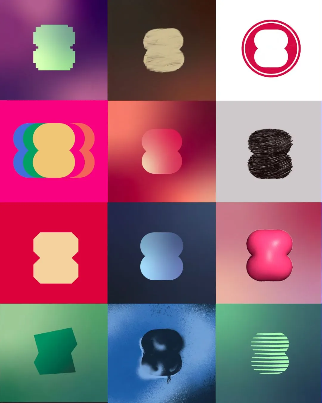
District Eight is Iván Galdeano’s Master’s Thesis for the Master’s Degree in Digital Graphic Design at Universidad Europea, and an example of the kind of social impact projects that a graphic design master’s degree can foster. The project addresses one of the most pressing challenges of our time: misinformation, the rise of far-right populist movements and political disengagement among Generation Z, through the creation of a multiplatform media outlet where graphic design places truth at the centre.
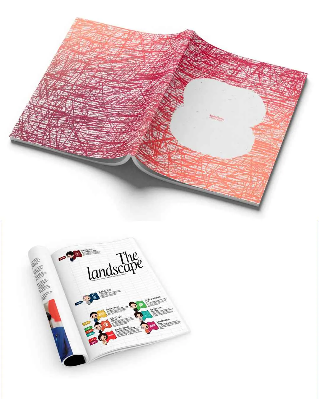
The proposal is structured as a complete transmedia ecosystem. The monthly print magazine uses sustainable materials, including FSC-certified paper, water-based adhesives and eco-friendly inks. The website adopts a freemium model with two versions —a low-consumption sustainable version and a visual version— organised around three pillars: Read, Listen and Support. The podcast, The Borough, offers narrated versions of articles alongside exclusive content, while a social media presence across X, Instagram, TikTok and YouTube completes the distribution strategy. Accessibility is embedded throughout: all articles feature voice narration, and audiovisual content includes subtitles.
The challenge is to combat misinformation, the rise of far-right populist movements and political disengagement among Generation Z —only 29% of young people report being interested in politics— through graphic and editorial design. The project had to engage young people who are less active in seeking information, offer a visual and condensed alternative to traditional journalism, and put visual communication at the service of information, connecting with current consumption habits without compromising journalistic rigour.
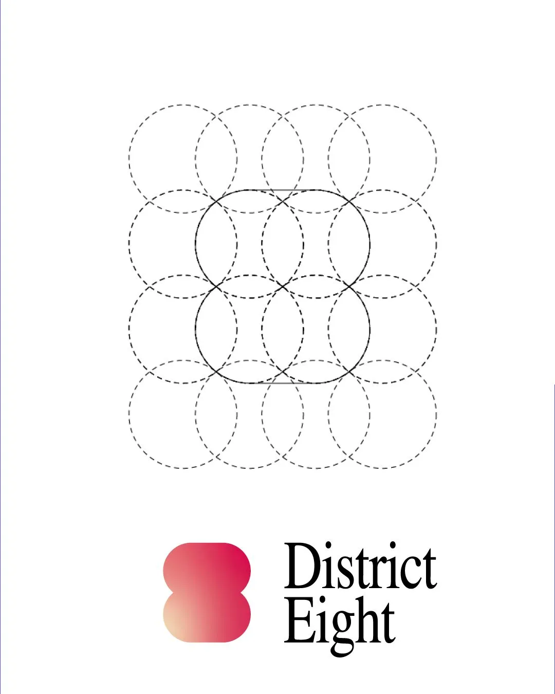
The inspiration comes from the analysis of leading international publications: Vox (minimalism and storytelling), Vice (urban and informal aesthetics), Panenka (feature and cultural journalism), Lux Magazine (visual identity and fashion aesthetics), Jacobin (bold design, colour and illustration), The Critic (use of illustration), Monocle (elegance), Colta.ru (abstract design) and Meduza (bold aesthetics and use of red). The naming is inspired by District 8 in Budapest, a historic stronghold of rebellion, while the weimarpolitics platform served as a reference for connecting with the target audience.

Design Thinking methodology
Using benchmarking, surveys (Google Forms), empathy maps, a SWOT analysis and a user journey.
Following sustainable production criteria (FSC-certified paper, water-based adhesives and eco-friendly inks).
Web design with two versions (sustainable and visual).