28838

Rebranding and digital strategy for Menta y Canela, a local flower shop in Madrid’s Prosperidad district.
Fátima Eugenio Quiroga
Ángela Hernández Domingo
Design, Master's degree in Lifelong Learning in Digital Graphic Design Online
2026
The project “Florecer como marca” focuses on the rebranding and digital strategy for Menta y Canela, a local flower shop in Madrid’s Prosperidad district. The main objective is to redefine the brand identity and strengthen its digital presence, transforming a local, product-focused business into a brand with a strong emotional component, capable of connecting with new audiences and competing in an increasingly digitalised market.
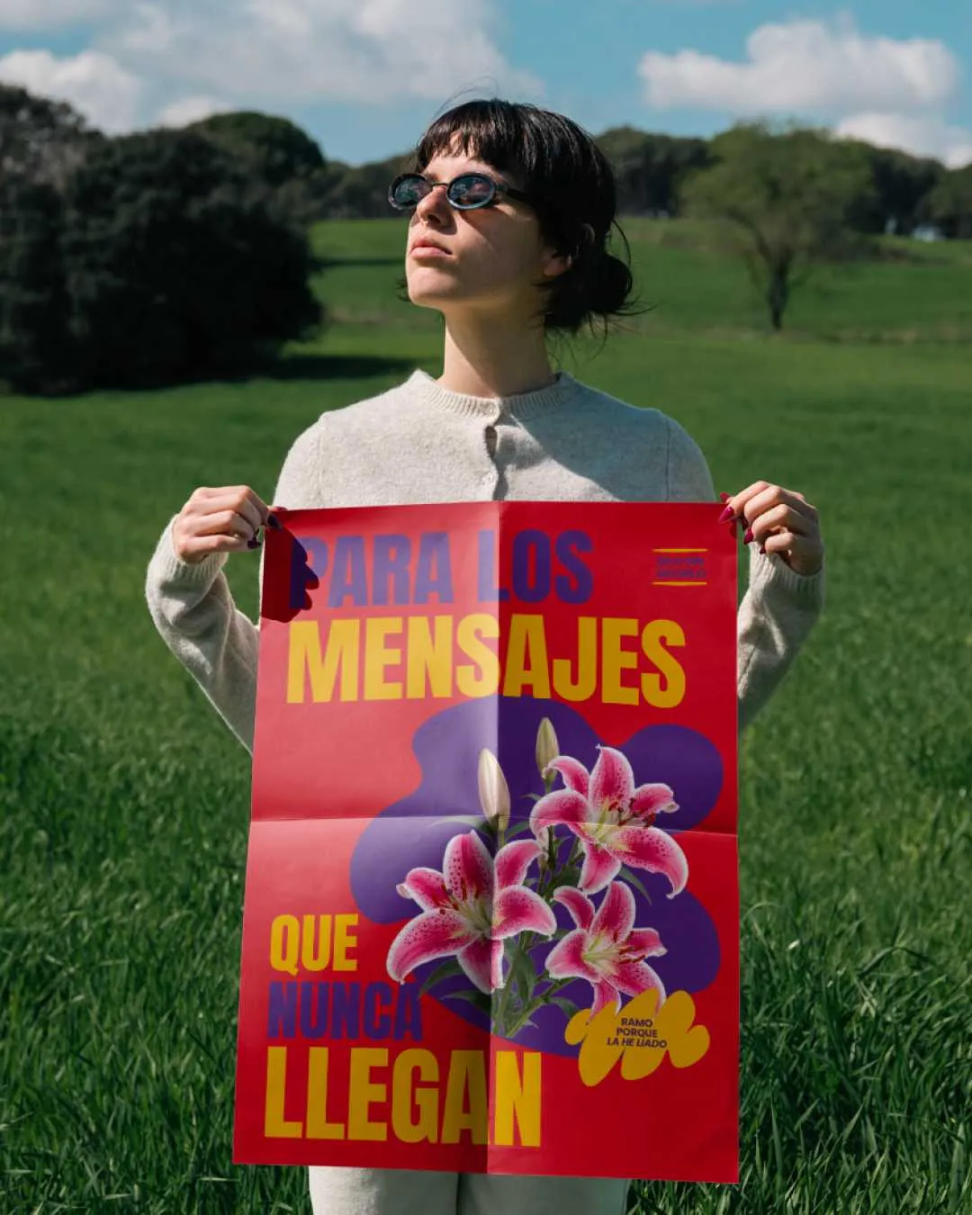
The conceptual starting point is the idea that flowers function as a language: a way of expressing emotions and messages when words are not enough. This insight is captured in the strategic concept “Say it without saying it”, which guides all the project’s design decisions, from the visual identity to the customer experience.
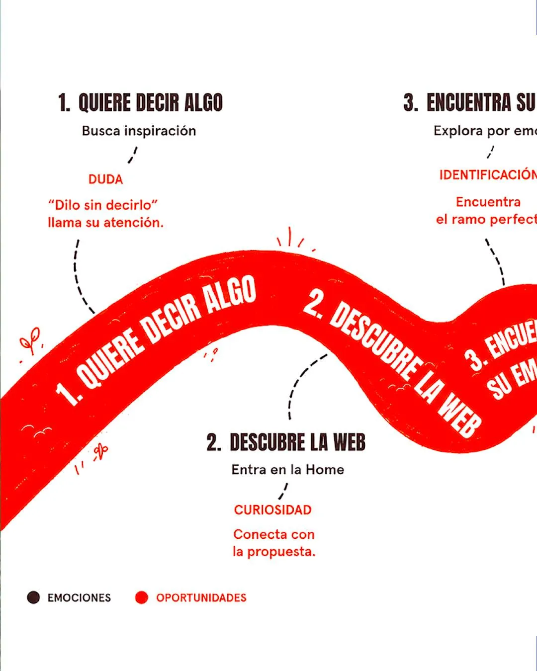
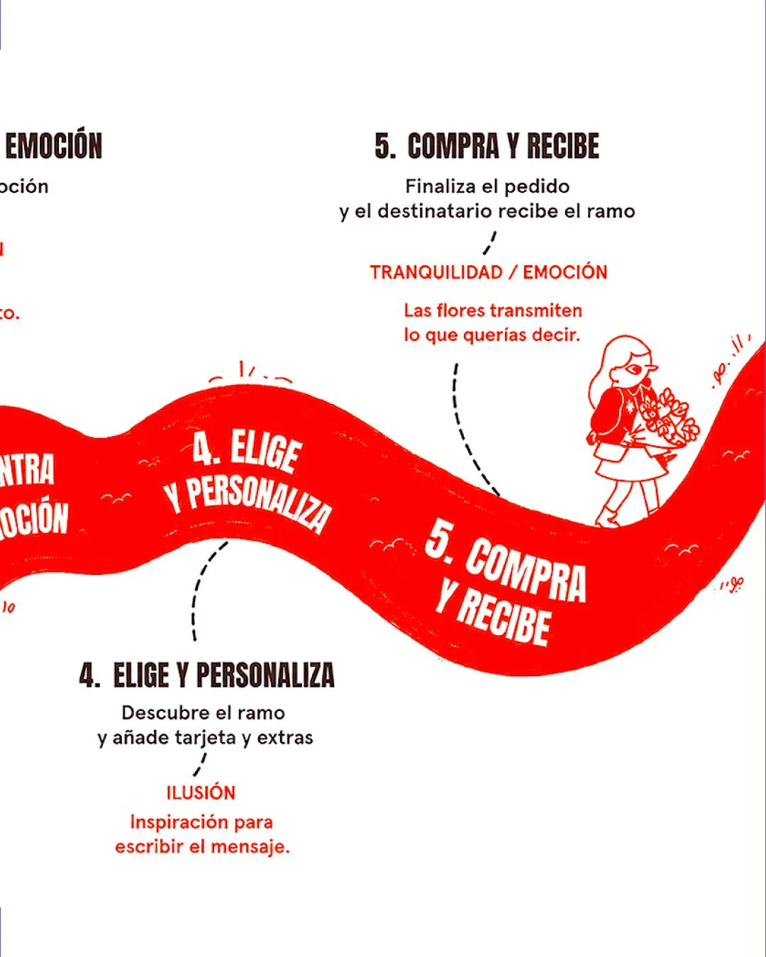
The main challenge is to transform the perception of flowers, understanding them not as decorative objects, but as a means of expressing emotions and messages when words are not enough. From a business perspective, the challenge is to redefine the identity of a local flower shop and strengthen its digital presence, shifting from a product-focused approach to one centred on emotional value and user experience, without losing the sense of closeness that defines a neighbourhood business.
The inspiration comes from the communicative power of flowers as an emotional language, captured in the concept “Say it without saying it”. As market references, six relevant brands in the sector were analysed: Colvin, Interflora, FloraQueen, Bloom & Wild, Freddie’s Flowers and Arena Flowers. For the visual identity, inspiration comes from the mint and cinnamon plants themselves, as well as from concepts of freshness and warmth, translated into illustrations, organic shapes and contrasting colour palettes.

Research and data collection
Mixed research methodology (qualitative and quantitative): Google Forms questionnaires, semi-structured interviews and documentary analysis.
Design Thinking as the project methodology.
For website design and prototyping.
Adobe Photoshop, Illustrator and InDesign for the development of the graphic system and brand applications.