27611

Packaging project for a range of sauces designed to accompany patatas bravas, developed within the Pentawards framework, in the food packaging category.
Elisabeth Vaqueros, Valeria Navas, Stine Borresen, Weronika Sirek, Valeria Ramírez, Angie Martínez, Areli Pérez and Scarlet Giménez
Paloma Rodera
2026
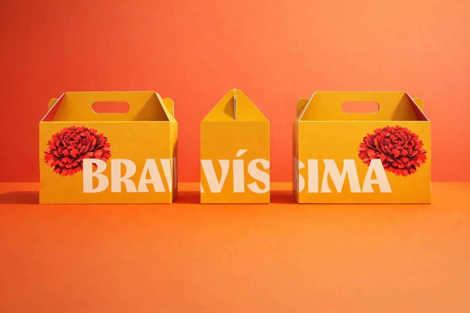
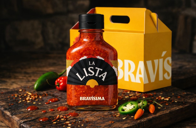
The Bravísima project is conceived as a packaging proposal for a range of sauces inspired by patatas bravas, one of the most emblematic dishes of Madrid’s gastronomy. The main objective is to design a container capable of standing out on the supermarket shelf, breaking away from the dominant industry aesthetic, characterised by the use of standard bottles and rectangular labels with little visual differentiation.
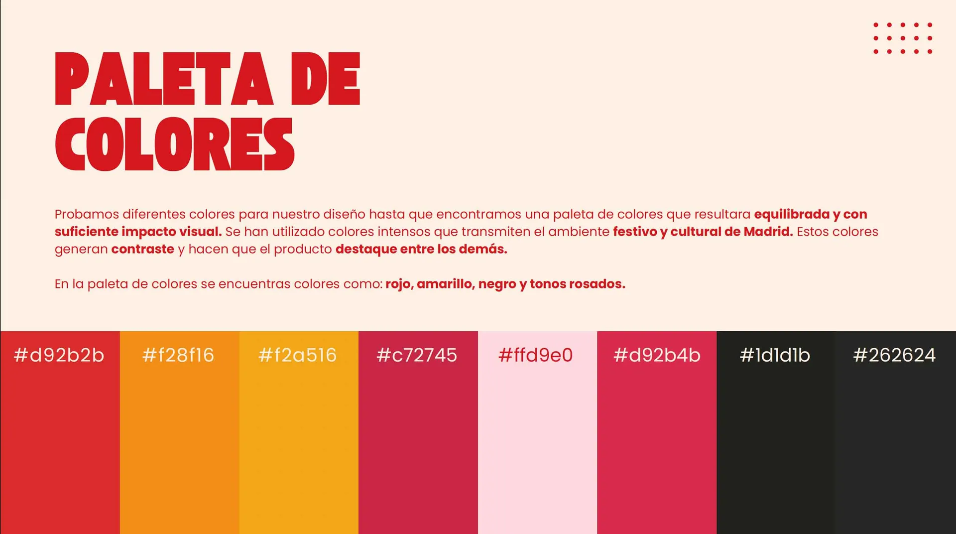
The concept of the project is built around Madrid’s popular culture, taking the San Isidro festival as a reference, understood as a symbol of collective identity and traditional celebration. Elements such as the fan, the carnation and polka dots are integrated into the packaging’s graphic system, reinterpreted through flat illustration, the use of geometric shapes and clean compositions that bring a contemporary reading to this traditional visual universe.
The product line consists of three variants: classic brava sauce, extra spicy brava sauce and aioli. To differentiate them, the project adopts an analogy based on the traditional types of San Isidro pastries, using the names La Tonta, La Lista and La Santa Clara. This naming system allows each sauce to be associated with a specific flavour profile, providing clarity for the user and reinforcing the brand’s cultural narrative.

The main challenge of the project is to design a packaging solution capable of standing out in a saturated market, such as that of food sauces, where standard containers and low-risk graphic solutions dominate. The proposal needed to stand out on the shelf through a recognisable visual identity, without losing clarity of use or brand coherence.
In addition, the project addresses the challenge of reinterpreting a traditional product from a contemporary perspective, incorporating local cultural references without falling into a purely folkloric aesthetic. The packaging had to balance visual impact, immediate legibility and conceptual coherence across the different product variants.
The inspiration for the project arises from Madrid’s gastronomic culture and, in particular, from patatas bravas as a symbol of the popular and everyday. This reference is extended to the San Isidro festival, understood as a visual and cultural expression of Madrid’s identity.
Elements such as carnations, fans and polka dots are used as a starting point to build an aesthetic rooted in tradition, reinterpreted through a contemporary graphic language. The inspiration does not aim to literally recreate the traditional “castizo” imagery, but rather to adapt it to a modern visual context.
For the development of the project, the Adobe Creative Cloud suite was primarily used, employing different programs depending on each phase of the process:
Adobe Illustrator
Used for the development of the graphic system, illustrations and typographic composition.
Used for image editing and retouching.
Used for the creation of mockups and visual tests for the project presentation.